Posts

Showing posts from May, 2018

Men's Health - Industries case study blog tasks

Hearst publishing 1) Hearst Communications , often referred to simply as Hearst, is an American mass media and business information conglomerate based in New York City, New York. 2) M edia industries and brands that make up the Hearst Communications conglomerate are-a wide variety of newspapers, magazines, television channels, and television stations, including the San Francisco Chronicle, the Houston Chronicle, Cosmopolitan, Esquire, 50% of broadcasting firm A&E Networks , and 20% of the sports broadcaster ESPN—the last two both co-owned with The Walt Disney Company. Also, " Hearst UK publishes 21 brands including ELLE, Harper’s Bazaar, Cosmopolitan and Good Housekeeping" 3) The global revenue for Hearst Communications (in dollars) for the most recent year on record is US$ 10.8 billion (2016). 4)" Hearst UK publishes 21 brands including ELLE, Harper’s Bazaar, Cosmopolitan and Good Housekeeping. Our brands reach over one in three UK women and one in

Representation and Men's Health: blog task

  Read these extracts from the journal article exploring the representation of masculinity in Men's Health magazine 1) Men's Health is defined as a 'lifestyle magazine'  because despite its clear orientation towards health and wellbeing, the magazine also includes further topics concerning men. In every issue, they make sure to show readers from the first pages that the publication is not just limited to healthy questions. 2) A dvertising is significant in helping to shape masculine identity because  it makes the men aware about their lifestyle and educates them.-"promote consumption as a way of life. It educates the masses into...." Advertising also helps men achieve what it means to be desirable and how they should look and act. 3)  The article suggests that the representation of masculinity in Men's Health is not fixed or natural and is subject to constant change. The media theorists that I have studied previously that can be linked to these

'Men's Health CSP analysis'

1) Media Language (e.g. conventions, narrative, genre etc.) The colours they have used are traditional/stereotypical to males- black and blue. Also, the colours are bold, dominant and strong , so this parallels with how males are meant to be. Reinforces traditional gender roles. The cover lines are in capitals and the font is bold . This reflects how the magazine is aimed towards men, because the typography indicates macho and heavy . They have underlined words for emphasis, this communicates power, strengths and authority . The masthead to covered, depicting how the magazine is well-established . The long shot of the model is of Vin Diesel, a popular actor, enables audience how he is important for his physique. Direct mode of address used emphasises confidence . Also, the use of the plosives 'BLAST BODY FAT'-  indicates idea of being bestial/dominant . 'Gut Gone in 60 seconds'- intertextuality . Imperatives used to show authority . Vin Diesel- seen

Magazine front cover - Learner response

Image
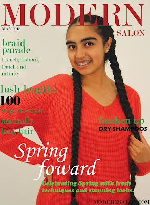
                                                                                             1) Level 4:                                                                    2) WWW: Very good layout and cover image.      EBI: The colours don't really compliment each other. The green font doesn't stand out on red background. 3) The strengths on my production based on the mark scheme: I had good application of  knowledge  and understanding of media language , this was demonstrated through the intriguing cover lines  etc. Also, I had deliberate control of connotations, e.g. referring to hairstyles and long hair.   Additionally.. My central image is very powerful, as I have used direct address which will lure the audience  in more and intrigue them in to reading the magazine. Powerful cover lines - they address the audience, as they have an emphasis, e.g. '100 ways to style naturally long hair' The typography used is identical to the original

Men's Health - Audience blog tasks

  Men's Health Media Pack 1) The magazine introduces itself by giving some background information on what Men's Health is, and what it contains. How they can change and improve a person's lifestyle. 2) The introduction suggests that the representation of masculinity in Men's Health is hegemonic. This is because they have used an exaggerated version of masculinity by showing a man with large muscles, it also focuses on more stereotypical elements of masculinity. 3) The print statistics of Men's Health compared to GQ and Esquire is much more higher. This indicates  that because Men's Health has a larger target audience , it has a larger readership, sales and circulation. 4) The difference between circulation and readership is that: Circulation : the actual number of copies printed and distributed. Readership : an estimate of how many people read the magazine in total (also known as readers-per-copy). 5) The circulation of Men's Health

Magazine practical task evaluation'

Image
1) My magazine:       2) In my opinion I believe that I have successfully met the brief for my chosen magazine. This is because I have created a new version of the magazine by keeping the conventions original. The tag and cover lines meet the demands of what the magazine is about.   3)   Compared to other original and existing magazines I believe that my magazine looks fairly professional, there are some minor bits I could have improved to make it look more professional. I believe that the style of my cover fits with the original magazine. The placement of the model and text is in the same place.   4) The strongest aspect of my magazine is the central image and main flash . This is because they use matching main flashes to the seasons and I have done that. Also, the positioning of the title and typography matches the magazines. Also, the colour schemes match.   5) The weakest aspect of my magazine is maybe colour of the background. This is because m