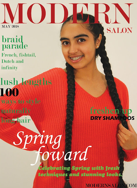
Magazine front cover - Learner response
1) Level 4:
2) WWW: Very good layout and cover image.
EBI: The colours don't really compliment each other. The green font doesn't stand out on red background.
3) The strengths on my production based on the mark scheme:
- I had good application of knowledge and understanding of media language, this was demonstrated through the intriguing cover lines etc.
- Also, I had deliberate control of connotations, e.g. referring to hairstyles and long hair.
- My central image is very powerful, as I have used direct address which will lure the audience in more and intrigue them in to reading the magazine.
- Powerful cover lines- they address the audience, as they have an emphasis, e.g. '100 ways to style naturally long hair'
- The typography used is identical to the original magazine, so makes it look quite professional.
- The colours I have used ae quite bold and vibrant so may be eye catching for a reader.
- The framing of the shot is done deliberately because you can see the 'long hair'. The magazine is a hair magazine.
- The costume is casual to stay with a more mainstream audience.
- The lighting is high-key, so that the reader is able to see the hairstyle.
- To reinforce the hairstyle element further, the model is holding her hair.
5) One piece of advice I would give to a student about to start the same magazine cover as mine is that they have to think carefully about the colour of the background and the colour of the text they will be using. This is because this magazine is about hair, the colours they usually use are bold, but more toned down, for the 'mood' and so that the hairstyle is visible. Also, you wouldn't want your colours to clash. Whereas, I have used more vibrant colours, so they don't really compliment each other or keep the 'mood' of an original magazine cover of this style.

Comments
Post a Comment